Comparing the Same Strategy Across Two Brokers
I ran the same Pine Script strategy on the NASDAQ 100 through two different CFD brokers' price feeds — OANDA and Pepperstone — and got a $2,447 P&L gap. This guide breaks down where the gap came from, and what it means for backtest robustness.
A strategy that backtests the same on two different brokers is not the same strategy in two places — it's a robustness test. I ran ORB_NAS_5M_V7 against OANDA NAS100USD and Pepperstone NAS100 over the same 12-year window and the same risk model. The bottom line differed by ~10%. This guide walks through the trade-by-trade comparison: how often the two feeds agreed, where they disagreed, and why a strategy with a tight 0.5×ATR stop is especially exposed to small price-feed differences.
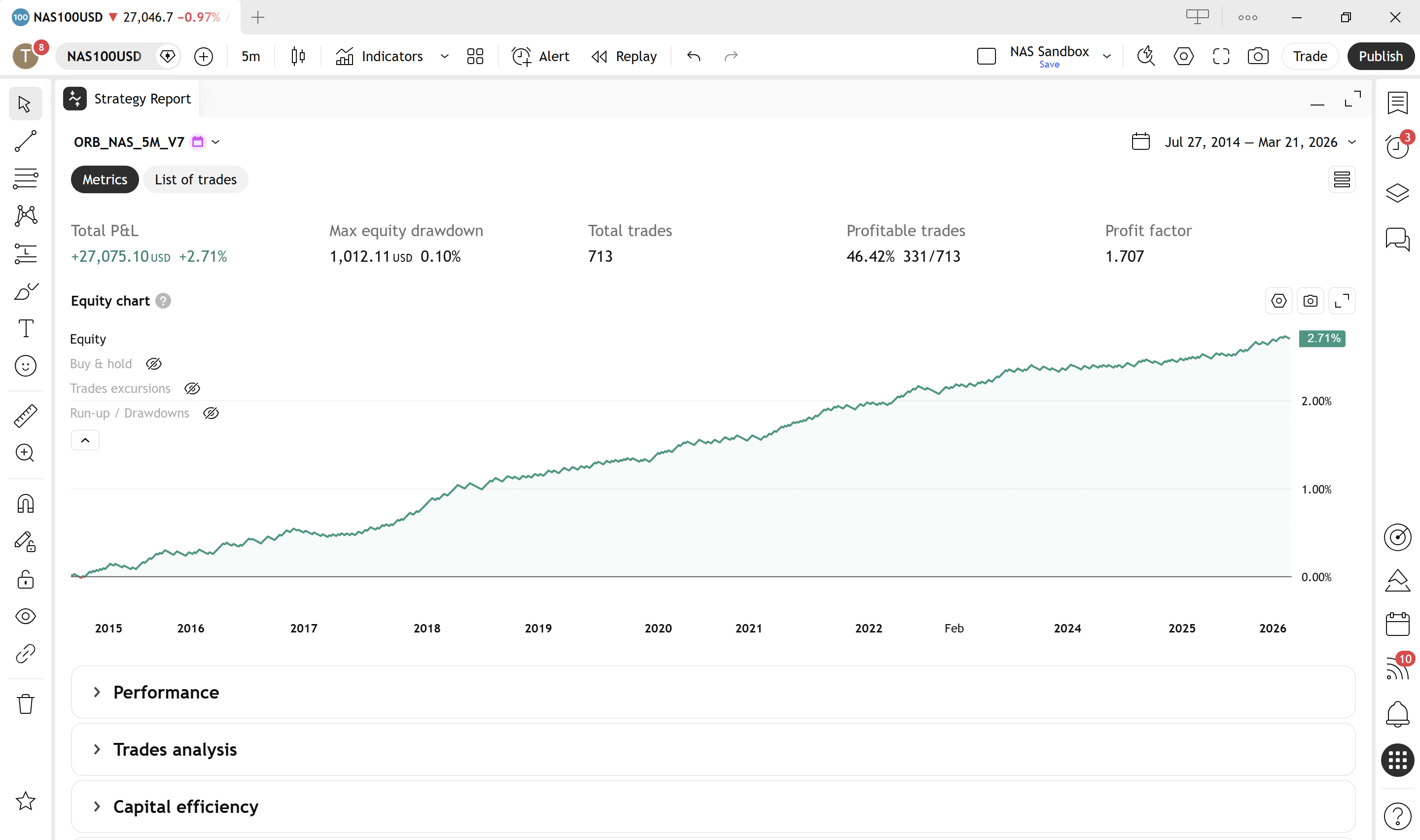
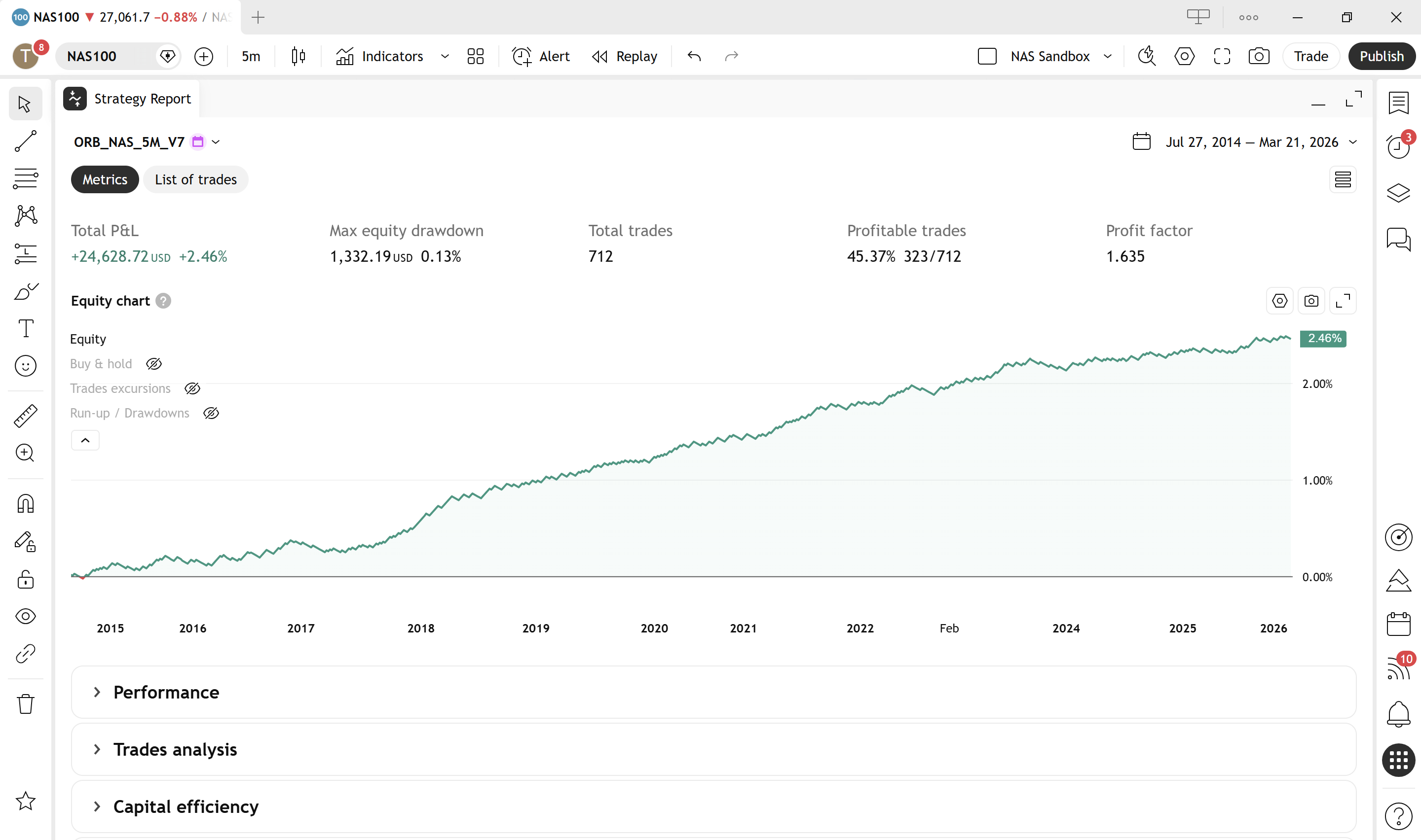
I ran the same Pine Script strategy — `ORB_NAS_5M_V7`, an opening-range breakout on the NASDAQ 100 5-minute chart — through TradingView's Strategy Tester twice. Same code, same 12-year window (2014-08 → 2026-03), same risk model: $100 risk per trade, 0.5×ATR stop, 1.0×ATR target. The only thing that changed was the data feed: once on OANDA NAS100USD, once on Pepperstone NAS100.
`ORB_NAS_5M_V7` is the strategy built in The Anatomy of a 5-Minute ORB Trading Strategy — the book walks through the design and validation of every filter, every parameter, and the 23-year backtest behind it. This guide reuses the strategy to do something different: stress-test how robust it is to a change of broker.
I expected the two backtests to look almost identical. They didn't.
| Metric | OANDA NAS100USD | Pepperstone NAS100 | Δ | |---|---:|---:|---:| | Total trades | 713 | 712 | +1 | | Total Net Profit & Loss (P&L) | +$27,075 | +$24,629 | -$2,447 | | Profit factor | 1.71 | 1.64 | -0.07 | | Profitable trades | 45.6% | 44.5% | -1.1pp |
That is roughly a 10% gap on the bottom line, from a strategy that traded with the same logic against the same underlying index over more than a decade. This guide walks through what causes that gap. The short version: most of it doesn't come from the trades that look very different — it comes from a tiny minority that look almost the same.
Why I'm running this experiment
This isn't an article about which broker is "better." Both OANDA and Pepperstone are reputable CFD providers, both pricing the NASDAQ 100, and both produced strategies that were comfortably profitable on this code. Either equity curve, viewed in isolation, looks fine.
The point is what the comparison tells you. Any reputable broker pricing a liquid index should land within a percent or two of any other reputable broker on a long enough sample. Both did. But "within a percent or two" is in the same neighbourhood as the edges most strategies live on. A strategy with a 1.7 profit factor on one feed and 1.6 on another is fine. A strategy with a 1.05 on one feed and 0.95 on the other has crossed from profitable to losing without anything in the strategy itself changing.
If you're evaluating a strategy — especially one with tight intraday stops — you want to know whether the result you're looking at is robust to feed variation, or whether it's a quirk of which spreadsheet you happened to download.
The 12-year window is set by Pepperstone, not by choice. Pepperstone's NAS100 history on TradingView starts in August 2014. OANDA's NAS100USD goes back to 21 March 2003, giving a full 23 years of data — and that's the period the book backtest covers. To compare like-for-like, I clipped the OANDA run to Pepperstone's earliest available date. The shorter sample is itself a real-world consideration: a longer history means more market regimes tested, and that availability is part of what you're choosing when you choose a broker.
What I compared
Three columns from the TradingView export do most of the heavy lifting in this comparison, and they're worth understanding before the numbers start. None of them are obvious if you haven't worked with strategy reports before:
- P&L (Profit & Loss) — the net cash result of a trade once entry and exit are settled. Positive = profit, negative = loss. This strategy uses fixed-cash position sizing: every trade is sized so a stop-out costs roughly -$100 and a target hit pays roughly +$200 (a 2:1 reward-to-risk ratio). Anything between those two values is an exit driven by something other than the stop or target — usually a session-end close or a strategy signal.
- MAE (Maximum Adverse Excursion) — the deepest point a trade ran against the entry direction during its lifetime. For a long trade, MAE is the lowest price the market reached between entry and exit, expressed in dollars of unrealised loss at that point. MAE tells you how close a trade came to hitting the stop. A winning trade with an MAE of -$95 against a -$100 stop almost lost; a winning trade with an MAE of -$10 was never in trouble.
- MFE (Maximum Favourable Excursion) — the deepest point a trade ran in favour of the entry direction. For a long trade, MFE is the highest price the market reached during the hold, expressed in dollars of unrealised profit at that point. MFE tells you the best the trade ever looked. A losing trade with an MFE of +$190 against a +$200 target almost won — and that "almost won" pattern is the signature of trades where one broker's price feed wicked through the stop on a 5-minute candle while the other's didn't.
Together, P&L tells you what happened, while MAE and MFE tell you what almost happened. That distinction is the whole point of this comparison: when the two brokers' outcomes disagreed on the same trade, how close did the losing side come to being the winning one? The answer turns out to be: very close, on a small number of trades, and that's where the broker gap comes from.
With those defined, the methodology is straightforward. For each broker's `.xlsx` export I:
- Reshaped the List of Trades sheet from 2 rows per trade (Entry / Exit) into one row per trade, capturing entry timestamp, entry price, exit timestamp, exit price, P&L, MAE, and MFE.
- Classified each trade's exit by its Net P&L:
- - TP if P&L > +$150 (cluster around +$200, the 2:1 target)
- - SL if P&L < -$50 (cluster around -$100, the fixed risk)
- - OTHER if in between (signal exit or session-end exit)
- Paired trades across the two brokers by entry timestamp. Trade indices drift between the two feeds — the third trade on OANDA is not the third on Pepperstone — so the trade number can't be used as a join key.
- Cross-tabulated the outcomes on matched pairs.
The classification works because the strategy uses fixed-cash risk per trade. SL hits cluster tightly at -$100 (98% within ±$10), TP hits cluster at +$200 (98% within ±$10), and the handful in between are genuine session-end or signal-driven exits. (For more on what's actually inside a Strategy Tester export, see What's Inside a TradingView Strategy Tester Export.)
If you want to run this comparison yourself, the two raw .xlsx exports are below — same strategy, same period, the only difference is the broker data feed.
Where the gap actually came from
After pairing, the combined sample broke into three buckets:
| Source | Count | OANDA P&L | Pepperstone P&L | Δ (OA − PP) | |---|---:|---:|---:|---:| | Matched pairs, identical outcome | 608 (98.4% of matched) | +$21,280 | +$21,142 | +$137 | | Matched pairs, divergent outcome | 10 (1.6% of matched) | +$1,560 | -$446 | +$2,006 | | Unmatched (entry on only one feed) | 95 OA / 94 PP | +$4,236 | +$3,933 | +$303 | | Total | | +$27,075 | +$24,629 | +$2,447 |
Two effects together explain almost the whole $2,447 gap:
- Ten trades where both feeds entered at the same minute but exited differently — one took the target, the other got stopped out. Those ten trades alone contributed $2,006 to the gap.
- Roughly 95 trades per broker that the other broker's feed never produced — small wick differences moved one feed's bar high or low across the breakout level while the other stayed flat. These mostly cancel, netting $303 toward OANDA.
The 608 trades that played out the same way on both feeds contributed only $137 of the difference, despite being 98% of the sample. That's exactly what you'd expect — when the trade plays out the same way, slightly different fill prices wash out over a large sample.
The story is in the small minority of trades that didn't play out the same.
The outcome cross-tab
Rows = Pepperstone outcome, columns = OANDA outcome. Diagonal = identical outcome.
| PP \ OA | TP | SL | OTHER | |---|---:|---:|---:| | TP | 272 | 1 | 0 | | SL | 7 | 331 | 1 | | OTHER | 1 | 0 | 5 |
The off-diagonal is small but lopsided. Seven trades were stopped out on Pepperstone but reached target on OANDA. Only one went the other way.
Here are the seven:
| Entry | PP exit | PP P&L | PP MFE | OA exit | OA P&L | |---|---|---:|---:|---|---:| | 2014-11-28 10:25 | 12:29 | -$99.75 | +$190.95 | 10:45 | +$199.94 | | 2021-11-04 10:19 | 11:19 | -$100.04 | +$191.47 | 10:50 | +$199.55 | | 2023-10-10 11:15 | 13:00 | -$98.70 | +$191.94 | 11:55 | +$199.78 | | 2023-12-18 12:20 | 16:05 | -$99.44 | +$161.92 | 14:39 | +$199.78 | | 2025-04-01 11:10 | 12:40 | -$98.28 | +$195.72 | 12:20 | +$199.28 | | 2025-06-03 10:05 | 10:09 | -$96.14 | +$29.44 | 12:15 | +$199.75 | | 2025-12-19 09:49 | 11:00 | -$93.90 | +$44.60 | 08:00 | +$198.85 |
Look at the PP MFE column. On four of the seven, the Pepperstone trade ran almost all the way to target ($190+ favourable excursion against a $200 target) before reversing into the stop. The Pepperstone bar wicked just deep enough on a 5-minute candle to hit the stop — which sat at 0.5×ATR below entry — while the OANDA bar kept the wick out of the stop, and the move continued to target.
That's the entire mechanism. On a strategy with a 0.5×ATR stop, the difference between 0.5×ATR and 0.55×ATR of bar-low can be the difference between a -$100 loss and a +$200 win. Repeat that seven times across a 12-year sample and you have $2,083 of P&L sitting on data-feed wicks.
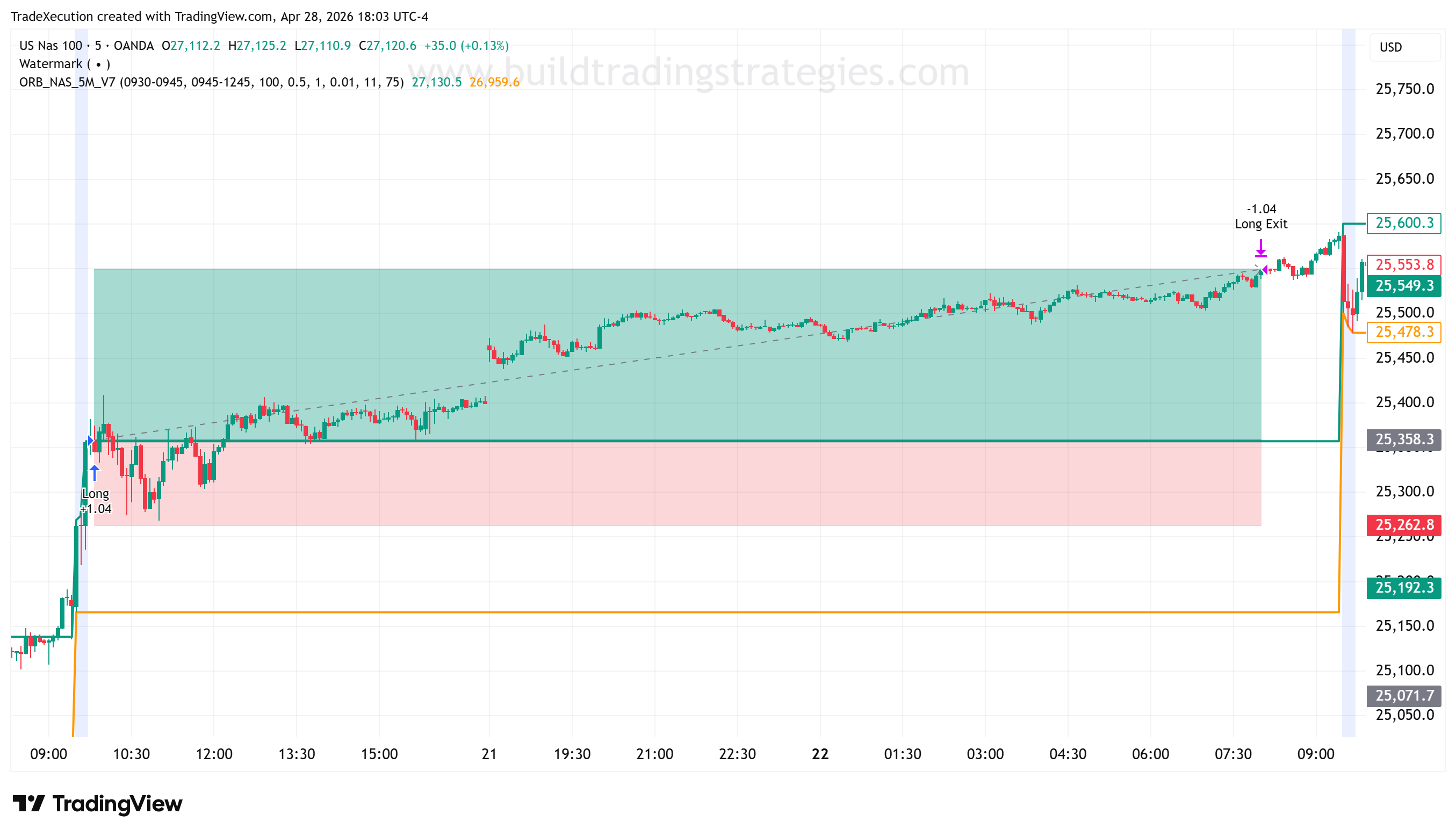
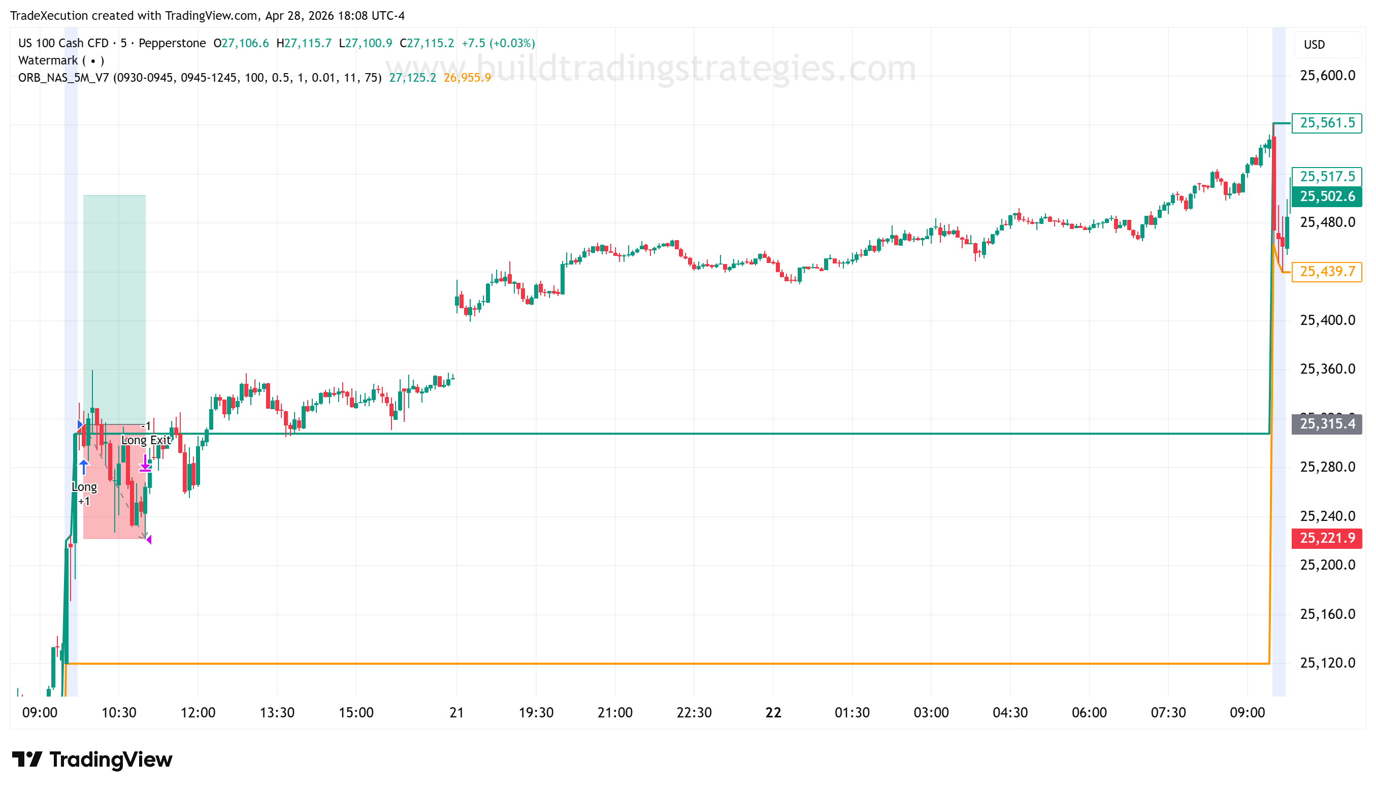
A worked example: 2025-12-19
The most recent of the seven divergent trades — and the most instructive — is 2025-12-19 at 09:49, a Friday entry.
- Pepperstone entered long at 25,315.30 and was stopped out 71 minutes later at 11:00, taking the trade for a -$93.90 loss. Maximum favourable excursion was only +$44.60 — barely 22% of the way to target before the move reversed and the bar low touched the stop.
- OANDA entered at 25,357.60 at the same minute. Its bar low through that Friday session reached an MAE of -$92.66 — within a dollar of where Pepperstone's stop hit, but never quite triggering OANDA's. The trade survived into the close.
- With the position still open, OANDA held over the weekend. When the market reopened on Monday 22 December at 08:00, NAS100 gapped higher and price ran straight to OANDA's target at 25,548.80 for +$198.85.
Two distinct things had to happen for OANDA to win this one. First, the Friday bar low needed to land on the right side of the stop — a difference of about a single NASDAQ point between the two feeds. Second, the trade had to stay alive long enough for the weekend gap to deliver the move. If Pepperstone's feed had also avoided the stop on Friday, both brokers likely take the same +$199 on Monday. If OANDA's feed had also wicked through, both take the same -$100 loss.
Neither bar wick is wrong. Both feeds saw real ticks for that Friday session; they just saw slightly different ones. That's the entire mechanism at work in the seven-trade table above.
What about the trades each broker had that the other didn't?
The strategy enters when a 5-minute bar crosses outside the opening-range high or low. If one broker's bar wicked just past the level on the entry candle while the other stayed contained, only the first broker fires an entry. That's how you get 94 entries on Pepperstone with no OANDA equivalent and 95 on OANDA with no Pepperstone equivalent — almost 200 trades that exist on one feed and not the other.
These extra trades net to a small advantage for OANDA (+$303) — small, because for a strategy with positive expectancy the extra trades are positive on average for both brokers, and the differences largely cancel. They explain a sliver of the headline gap, but not the bulk of it.
Why this isn't a vote for one broker
Two things are worth keeping in proportion.
The two equity curves still look almost identical. Both monotonically up and to the right, similar shape, similar drawdowns. The strategy's edge is robust on both feeds. The edge is just a few points narrower on one than the other.
Which broker comes out ahead is sample-specific. I have no doubt that on a different strategy — different stop placement, different timeframe, different instrument — Pepperstone could come out ahead by a similar amount. The point isn't that OANDA is better. The point is that small price-feed differences compound, and on a strategy with tight intraday stops they will materially move the equity curve.
The question to ask isn't "which broker is right?" — both feeds are real, both are tradable, both are auditable. The question is "is my strategy robust enough that ~10% feed-driven variance doesn't change my conclusion?" If a strategy looks great on one broker and break-even on another, you don't have a strategy yet — you have an artifact.
A reputable broker is one whose price-feed differences are within a few percent of any other reputable broker over a long sample. What you do not want is a broker whose feed deviates systematically — where stops fill consistently worse, where bar wicks are noticeably bigger, or where the equity curve diverges by 30%+ from a peer. That kind of gap is a red flag, not just feed variance.
What I'd take away from this
A few practical implications:
- Backtest on the broker you intend to trade with. If you're going to deploy through Pepperstone, the OANDA backtest is informative but not definitive. Re-run it on the broker's own symbol and compare.
- Stop scale matters. This strategy uses a 0.5×ATR stop — relatively tight. Strategies with wider stops are less feed-sensitive, because price-feed noise lives within the stop distance instead of straddling it. (Background: ATR (Average True Range), Risk Reward.)
- Look at MFE on the trades that lost. If your losing trades show consistently high MFE before reversing into the stop, you're more exposed to feed differences than someone whose losing trades go straight against them from entry. MFE is in the Trade Analysis sheet of the export.
- Don't chase the better-looking backtest. If two of your broker exports differ by 10%, the better number is not "the truth." Take the worse one as a more honest planning baseline and trade only if the strategy still meets your criteria there.
The companion guide How I Build a TradingView Strategy That Matches My Broker's Constraints covers the other half of this story — encoding broker-specific volume, session, and pricing rules inside the Pine Script itself, so the backtest is at least asking the right questions about the broker you've chosen.